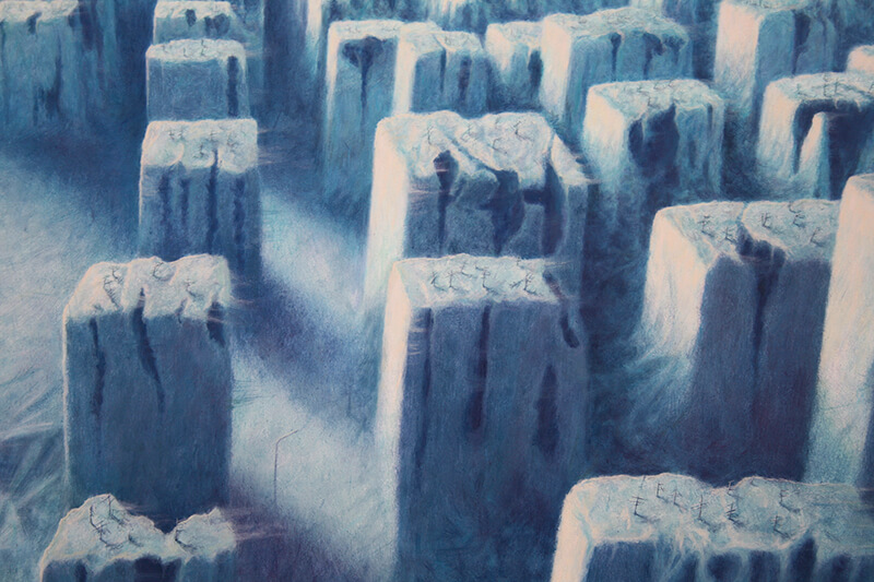
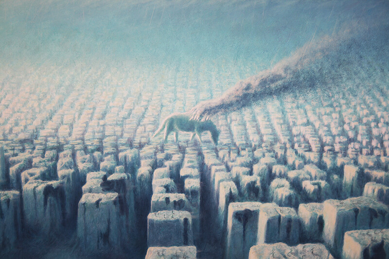
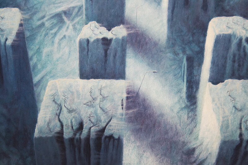
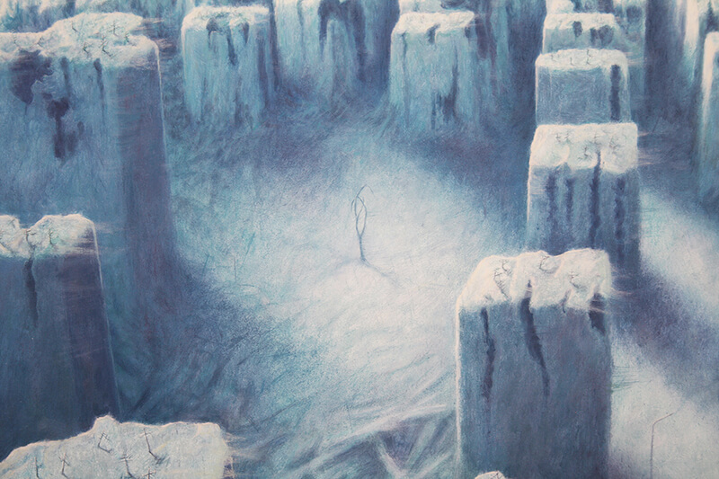
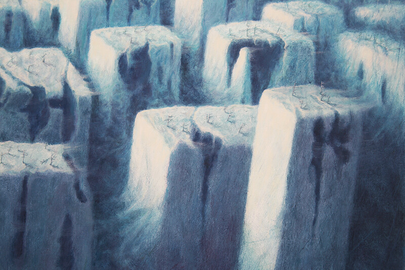
The picture showing an empty city with a burning quadruped walking was created a bit faster than the previous ones. This resulted from the search for new solutions to operate with the oil technique, specifically a different method of applying paint and using a different type of brushes, previously widely omitted. As the effect was even promising, I decided to explore new possibilities and see what will come of it in the next works. I am not titling pictures on purpose. Painting of this type, i.e. mostly visionary, where the finished work more or less resembles what you have “seen” – in my opinion – it does not need titles, or even contradicts them. This is due to the structure of the picture. Just as dreams are not foreshadowed by large, gliding titles and we do not wake up when the curtain with the words “The End falls”, and the artistic vision cannot be given a title. something completely different than the beginning would suggest. This is a coincidence, which in my case is a very important creative factor. Hence my opinion is that in most cases the title is an attribute of a different type of painting and can easily be omitted. viewers. When experiencing a vision, you need to be sensitive and do not blur this gently obscuring the awareness of the film with sudden concentration of attention, because then it is easy to “turn off the channel”, which I could most easily compare to the situation of taking someone out of the thoughtful state. After a while, however, you do have some practice and control over the process. How does it look like? Contrary to appearances, this is not a complicated process and everyone, but absolutely everyone, can imagine it – literally. Well, if we think about any thing, it usually appears before our eyes in all its glory, detail, almost with photographic accuracy. It’s like putting a photo with high transparency on the eye lens, through which we see reality. Everyone has it and this is what it looks like. The process is interesting because it is usually not a problem to imagine, for example, a horse’s silhouette, which will be appropriate, in proportions and with perfect lighting. The problem arises when it is necessary to recreate the image in the form of artistic techniques. Of course, the example above is one of the many ways in which a concept for a future image is born. Returning to the topic: At one point, while sketching a completely different idea, I saw a view of the city from a certain height with a slowly walking, burning pet. A second later I had it roughly sketched. After some time, I started working on a pencil sketch on the support. Earlier, however, I considered which staff would be the most advantageous: vertical or horizontal? The level seemed more natural due to the greater sense of scale due to the width, but I had the impression that vertically the image would be stronger to perceive and the depth more distinct. Another thing was the composition: how to place the buildings? How to create an urban layout that would reflect the layout, but also not fall into perspective? “Streets” should be done diagonally or straight? Another very important issue is choosing the right lighting. On this point, I had several versions in my head fighting for priority. It may be hard to believe, but in my case it is this stage of work that I consider the hardest and probably the most important. Often these are many hours of reflection, calculation and a series of analyzed sketches. Finally, the outline of the city appeared on the vertical base, in which the most visible street ran straight, and the city itself was situated on two hills, where the first collapsed, giving the possibility of showing further plans, and the second disappeared somewhere deep in the thickening air. I put the lighting slightly on the left side, so that the shadows were filling the square on the left side and the shadows crossed the line of the “street” so that it did not seem too intrusive. I also wanted the rays of light to contrast the objects on the right. From the bottom, I wanted to get the effect of gravity, so that the whole thing shoots strongly from the bottom up. I chose the color at the end and referred to one dream I had a few years ago, where the stage was illuminated with a narcotic blue-greenish light. In the end, the color and the whole work “set” by itself, although in this case the general compositional assumption remained unchanged. In the course of work, a form of “buildings” appeared, which were originally supposed to be tied with some huge, scaled wire resembling more sheaves of hay that fly out of the combine during harvest, but the stains painted at the beginning “suggested” that the “buildings” should bear traces of strong, open damage. To make it look like “buildings” at all, I created old type radio and television antennas. Why such? I have a certain fondness for my childhood and I draw from this period details that I did not distort in this case. While painting, I found that the damage is so sufficient that no windows need to be added. It was supposed to be as dead as possible. I would also like to emphasize the deadness with a withered “tree” in the middle of the square on the left. The first brush strokes of the quadruped figure raised the question: what to choose? Horse or dog? I decided that I would not be particularly concerned with defining the species, but nevertheless it probably looks more like a dog, which perhaps fits more with the whole picture than the kind of “nobility” of a horse that this animal has in our culture. I was also wondering whether to paint the “young” walking beside the howling. Since the “old” was on fire and was supposed to burn from above, it was known that he would die, then adding “young” would theoretically emphasize his loneliness and imminent death, but it was not finally known, so I stayed with the “old” and his certain death. On the other hand, I didn’t want to escalate the drama unnecessarily. The end of a lonely animal’s life seemed enough to me. The rest “painted itself”. So it spontaneously turned out that the animal was going into darkness, as if without much (or maybe quite the opposite!) Awareness that it was burning. At one point, I felt strongly to “close” the image from above. Clouds from a certain height arranged them in this and not another way, and I left them in this form without thinking too much, although I am not sure of their form so far while writing this text. At the very end I added a few street lamps, but I didn’t want to “enliven” the whole thing too much with such details. I found them redundant. They answer the question: “Why does the picture represent what it shows?” – in short, this and the others are a reflection of myself. The city, breathless, perhaps without time, without desires, is a dead place, but it is also a city without the burden of everyday struggle for survival, without problems, without fear for something, for someone, for yourself. Such a place corresponds to a conscious resignation from everything in exchange for the total and eternally certain peace of some undefined, full of aesthetic sensations of a metaphysical existence.

